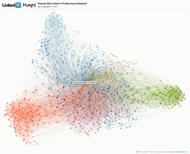
Pretty interesting and cool visualization feature from Linkedin that rolled out recently (side note, Linkedin’s blog is in our WP.com VIP program).
This visualization shows how your Linkedin contacts cluster based on your employer, different affiliations, and groups. Here’s mine: (click through to see the labels)
